The brief Statsyuk's idea is simple to say: upload a game, and every player gets their stats back from the tape. As their own pitch puts it, youth hockey analysis hasn't kept pace with the game.
What they didn't have yet was a product to look at. Before anyone could design the flows, the brand needed rules: colours, type, and a set of components that could carry a phone app and a web dashboard without drifting apart. So the work came in two parts. First the system, then the screens built from it.
Starting from the rink I started with research and a moodboard, then took the palette straight from the arena. Rinklight Blue, the core brand colour, is the cool glow of lights on fresh ice. Frostbite Blue adds depth and contrast for key actions. Breakaway Teal is the accent, kept for motion and the moments that should feel quick.
Under those sit the neutrals, Shark, Frost and Sea Glass, and green, yellow, red and purple for status. Each colour is an eleven-step scale, so a single hue covers a background, a border and its text.
The primary palette: three blues and a teal, named for the rink. For type I paired Baloo 2's rounded, heavy headings, friendly for young players and loud enough for a scoreboard, with a quieter body face. Desktop and mobile each get their own scale, so a display heading at 64px on the web steps down to 40px on a phone instead of simply shrinking.
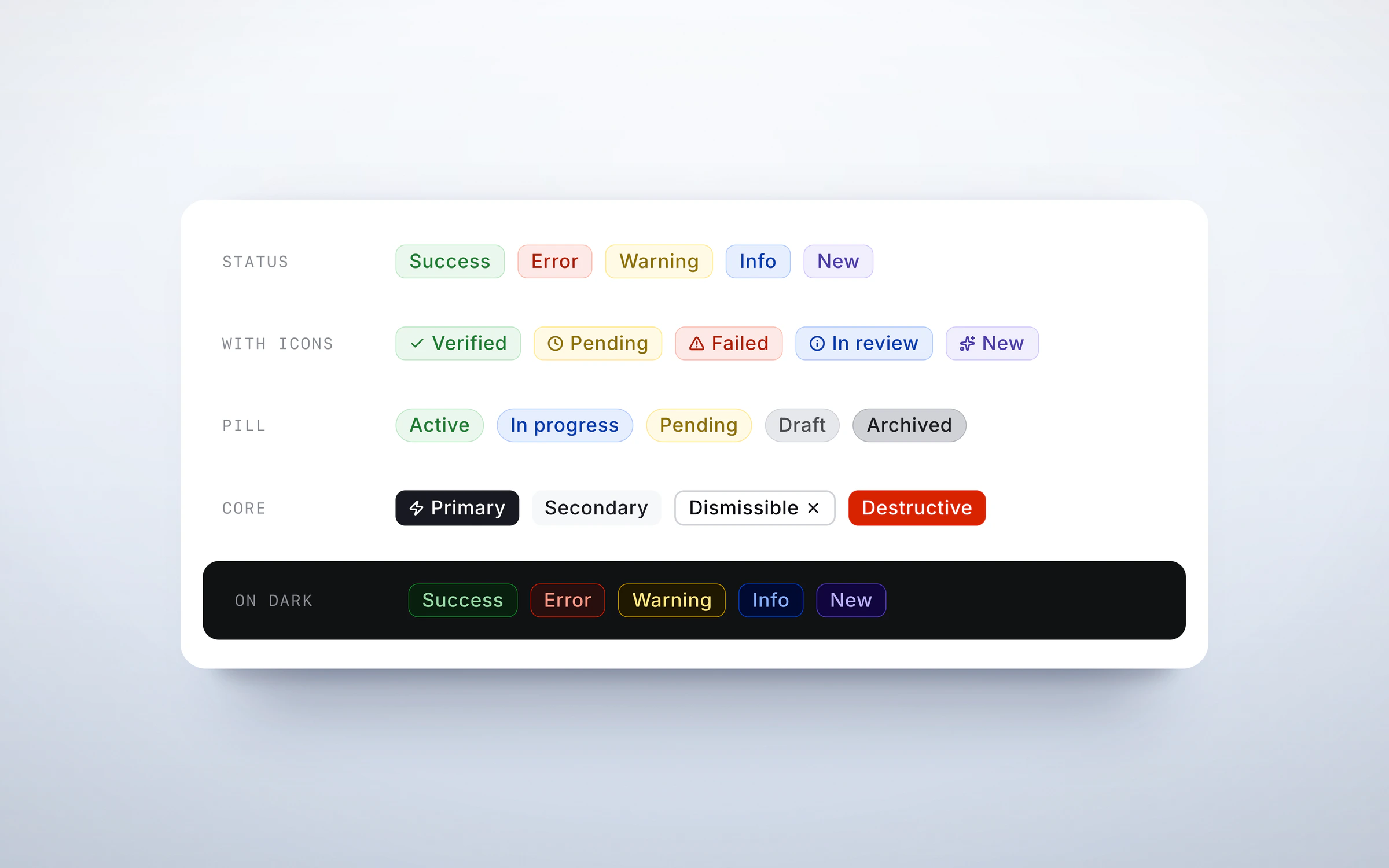
What the system covers Foundations: colour, type, spacing and shadows Buttons: primary, secondary, tertiary, icon and social sign-in Inputs, dropdowns, checkboxes and toggles Badges and tags, avatars, cards and progress bars Tooltips and chat bubbles, and an icon set The logo in three lockups, and the team mascot Two ways in With the system in place, I was asked to put it to work on onboarding, which has two very different audiences.
Players sign up on their phones. Shutter, the team's husky mascot, walks them through building a profile one question per screen, so a long form feels like a conversation and every step ends in a single clear button. It finishes with a welcome and a prompt to upload their first game.
Coaches and team admins sign up on desktop, where there's room for the team set-up they'll do once. The same buttons, inputs and illustrations carry across, so moving from the phone to the web feels like the same product.
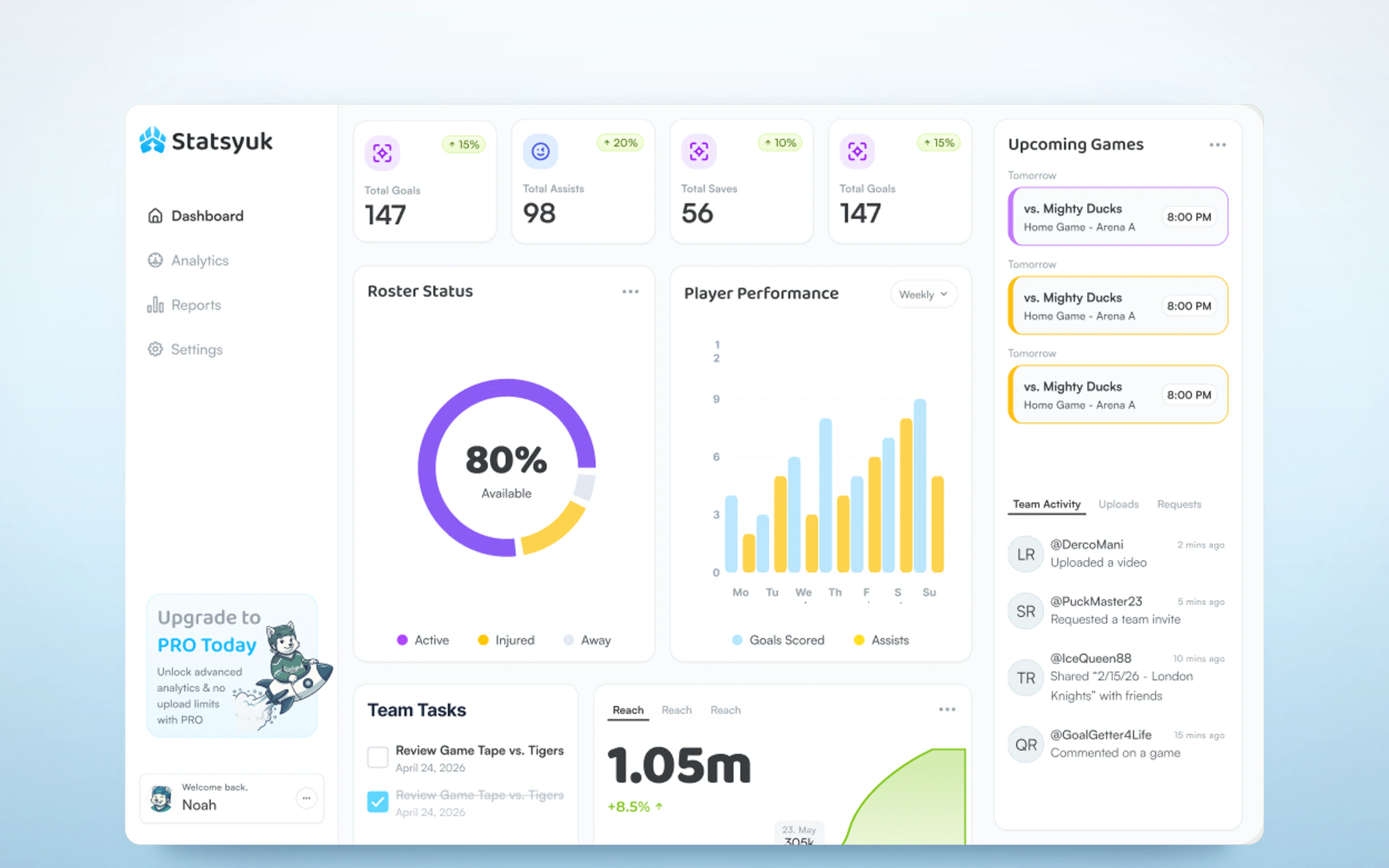
Desktop sign-in for coaches and team admins. The dashboard The last piece was a concept for where a coach lands after signing in. At the top are the season's totals for goals, assists and saves. Below them sit who's available for the next game, how players are trending week to week, what's coming up on the schedule, and what the team has been uploading and sharing.
It's made entirely from the system's parts: stat cards, badges, tabs, avatars and the chart colours from the palette. That was the real test. If the dashboard needed new pieces, the system wasn't finished.
The site Statsyuk also needed somewhere to send people before the product existed, so I designed and built the marketing site in Framer. It leads with the pitch, “Every shift tells a story. Now you can see yours,” and a waitlist sign-up, then walks through what the product does, how it works and the questions families ask first.
It's the same system again, on a third surface: the rink palette, Baloo 2 headings, the pill buttons and the illustrated players, laid out for desktop and rebuilt for phones rather than squeezed onto them.
The About section: four feature cards, two of them showing a piece of the product. What I handed over A Figma library with the foundations and components documented page by page, the mobile onboarding flow end to end, desktop sign-in and sign-up, the dashboard concept, and a live marketing site. It gave Statsyuk something to build from, and something to show.