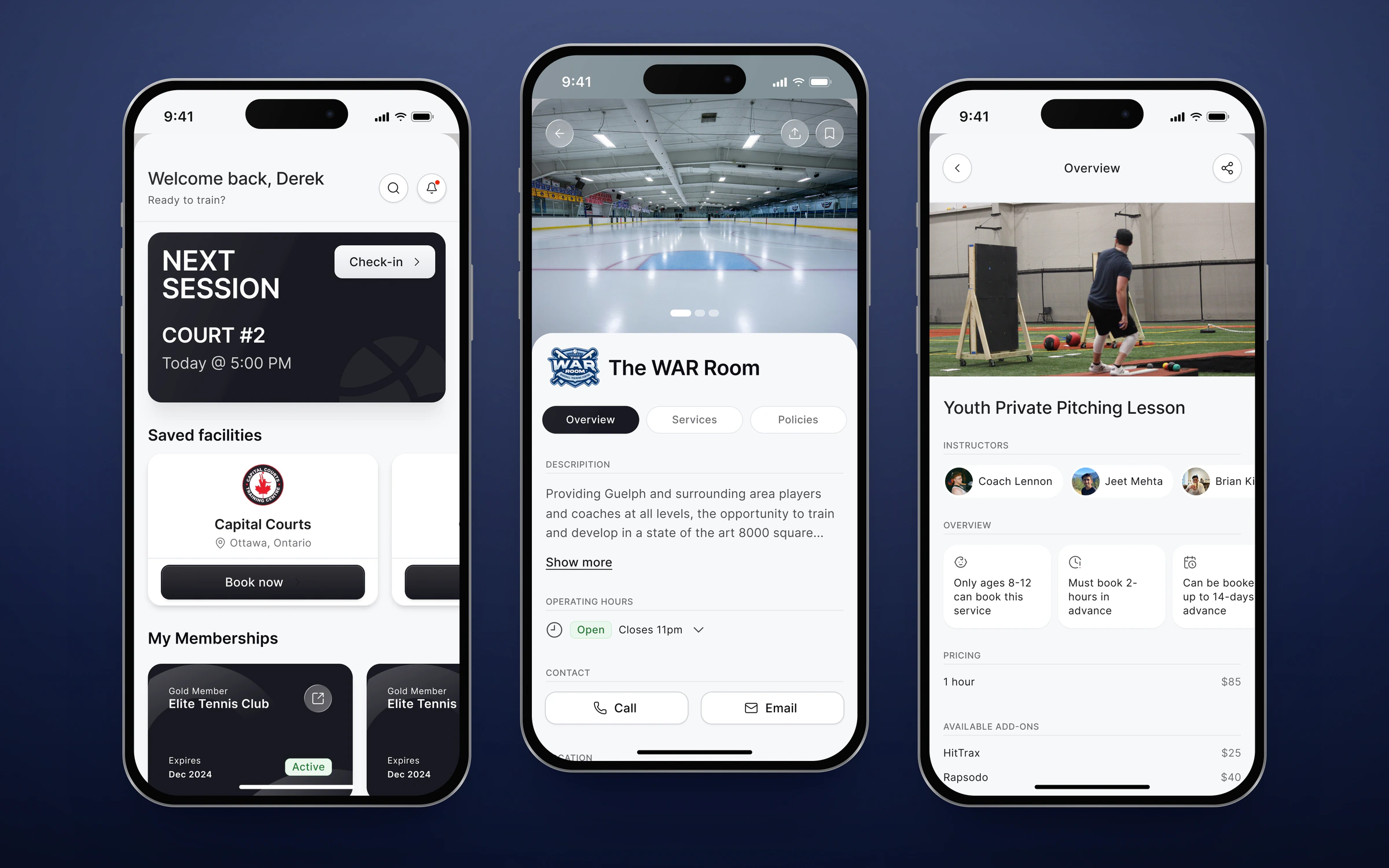
The brief Swift's customers are training centres, cages, courts and rinks. Their customers, the players and parents, were the ones who actually had to book, and they needed one app that worked the same at every facility they trained at.
The job was to design it end to end: a home for what's coming up, a way to find and save facilities, booking for everything a facility sells, and everything after, from rescheduling to unlocking the door. I led the design from the moodboard and information architecture through to dev-ready flows, then reviewed the build with engineering until it shipped.
The scope 96 screens in the shipped app, across four tabs and seven flows Six kinds of booking: rentals, lessons, classes, camps, packages and memberships Around 250 dev-ready screens and states in Figma across 14 flows, with 60 more for classes 166 components in the app, built on Swift's own design library Built with five engineers, over 784 commits between March and September 2026 The four tabs: home, search, bookings and profile. One shape for six services The hard part wasn't any one screen. It was that a cage rental, a private lesson, a week-long camp and a monthly membership are different things to buy. Lessons have instructors. Camps have age limits and sign-up deadlines. Memberships bill monthly and prorate the first payment. Rentals come with equipment and add-ons.
Rather than design six apps, I gave every service the same overview, with the rules that matter up front as plain cards (who can book, how far ahead, how many spots are left), then the price and the extras. Booking follows one sequence of steps, and each service only adds the steps it needs: an instructor for a lesson, a player for a camp, credits for a package. Learn one, and you've learned them all.
A lesson, booked: choose a time, check out, done. A cart that comes with you Most bookings are more than one thing: two time slots, a cage, a pitching machine. So the cart rides along at the bottom of every step as a small bar, showing what's in it and the running total, and opens into a full sheet when you want to change something.
Because it appears in every flow, it has to handle every case. I specified each state for engineering, down to the ones that are easy to miss: a credit covering a slot, a discount striking through the old total, a rental where the price can't be known until a time is chosen, and reschedule mode, where items are locked and there's nothing to pay.
Seven states of the cart sheet, laid out for engineering. Before and after the booking A booking app is judged on the moments around the booking too. Guests can browse any facility without an account, and are only asked to sign in when they go to book, with a one-time code instead of a password. Parents can book for their kids from the same account.
After booking, everything lives in one place: the details, the price, reschedule and cancel. At facilities with door access, the booking becomes the key. An access link opens shortly before the session, and unlocks the door from the phone.
Manage a booking, then let yourself in. Working with engineering With five engineers building in parallel, the Figma file had to work as a hand-off, not a gallery. It's organised as a pipeline: research and the moodboard, then designs for review, then a page per flow marked ready for dev, with everything that was cut kept in its own descoped page rather than deleted. Each dev-ready flow shows its states side by side, logged in and logged out, empty and full, so nobody had to guess.
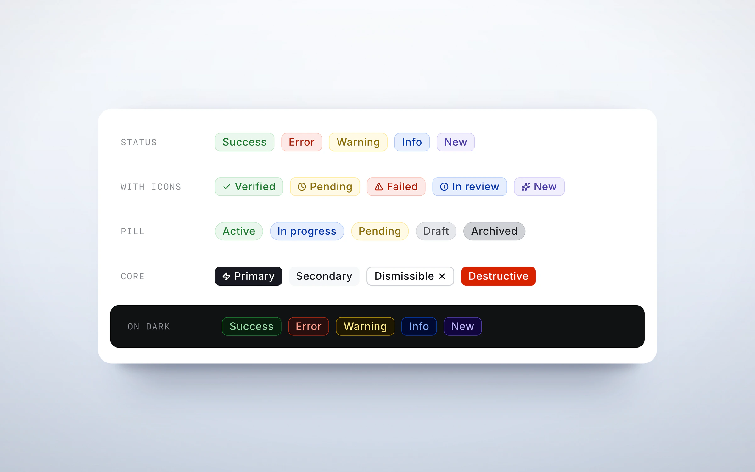
The app is built on Swift's design library, so most screens were assembled from parts engineering already had, and a change to a component reached every flow at once.
Where it landed Swift Booking shipped to players and parents across Swift's facilities. PLACEHOLDER — anything you can share about adoption, bookings or reviews.